Positioning | Brand and Design Language | Website UI/UX | Film
Problem statement:
Helping a plant based cleaning brand create its mark in a category crowded by veteran players.
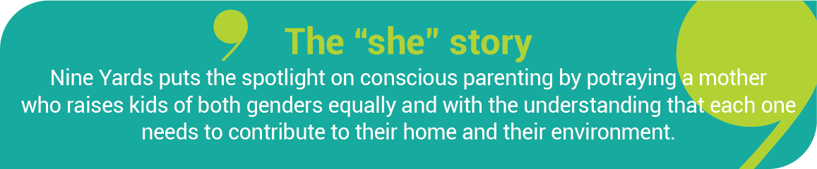
Opportunity: With Koparo Clean being natural and completely free of toxins, it’s the perfect brand to speak to people who choose to live a conscious life not only for themselves but also to teach conscious living to the next generation. Borrowing from our own lives as mothers, juggling with various responsibilities through the pandemic, we realized that it’s never been more important to inject the right habits in our little ones such that they become conscious citizens of the future.
Work: In most affluent homes, kids don’t understand the value of the hard work others put in for them. In our brand story of an ideal ‘Koparo home’, the spotlight shifts from doing the task perfectly to inculcating in impressionable minds the importance of ‘doing your bit’. With Koparo, you can be good as well as do good.
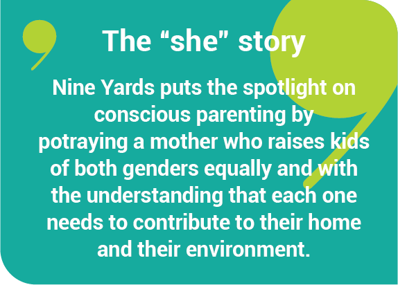
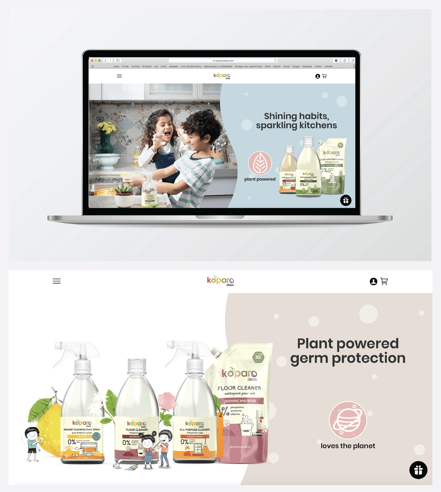
The Nine Yards squad began by reinventing the design language to set a clean, soft and playful look for the brand. A pastel palette with rounded edges, bubbles and a flowy font gave it a happy, fun and fresh vibe. The website was redesigned to soak in the brand personality, right from the colours to the visuals.
As for the learning opportunity for children, we addressed it through a beautiful film based on a day in the life of a Koparo home.
Khel Khel Mein Soaping Cleaning Shining Kar Daalo!
Removing the “chore” from chores so it’s not a bore anymore, but a chance to have fun with your loved ones, leaving a sparkling clean house in the process! And leaving the next generation with a larger message of being conscious citizens of tomorrow, all while having fun with Koparo.
Takeaway: Life is Fun with Koparo